
While significant in itself, the event probably represents the point at which webmasters and businesses owners finally had to take mobile seriously. It was a turning point. You could no longer afford to pretend the mobile revolution wasn’t happening. It was time to acknowledge, and embrace it.
But it’s not just about Google’s search results. As we’ll see, there are many other very advantageous reasons for ensuring you have a mobile-compatible website. I’ll also show you exactly what this ‘mobile revolution’ means in terms of your visitors, and your prospects and marketplace on social and email. There are also profound implications in relation to video and mobile usage.
Above all, you’ll see how a mobile-compatible website is now essential for ensuring you can ‘Be Everywhere’ in front of your marketplace, building your relationships, your authority and credibility with your audience.
What Is The ‘Mobile Revolution’?
 When I first started online fifteen years or so ago, mobiles had no relevance for Internet traffic. Smart phones didn’t exist, at least in any meaningful sense of the word. People just didn’t browse the web on their mobiles.
Over the following few years, mobiles continued to evolve rapidly, with a small, insignificant proportion of Internet usage via the Blackberry, Palm and one or two others. It was mainly business usage. Network speeds and device design meant it all stayed very small scale.
That all changed in 2007 with the iPhone, followed hot on the heels by Android devices, introducing smart phone technology to consumers en masse. Combined with much faster network speeds, the mobile internet was born.

By Matthew Yohe. Licensed under CC BY-SA 3.0 via Wikimedia Commons
And now of course there are multiple mobile devices offering internet connectivity, with a whole range of tablet computers from iPads to the Kindle Fire joining the fray.
Where Are We Now?
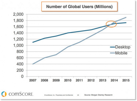
It’s taken several years for mobile internet consumption to creep up to the levels of desktop. It has not only done just that, but now exceeded desktop usage.
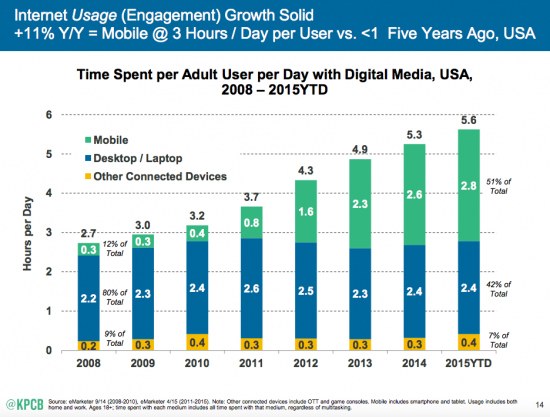
As the following graph shows, the time spent per day with digital media on mobile devices has grown from less than 1% in 2008 to now over 50%. That’s a lot more than the time now spent on desktops, at 42%.
Some data suggests even higher levels of mobile consumption. According to comScore, 60% of digital media time is now spent on smartphones and tablets.
In terms of actual website traffic, data for Google shows that roughly half of their traffic is now from mobile. So it’s easy to understand the reasons behind their July update, and why they don’t want to send their mobile users to sites that provide a poor mobile experience.

But this data varies widely from site to site. Even between search engines (for Bing, mobile accounts for roughly a third of their traffic, rather than half as with Google).
For vWriter.com, not far off 20% of traffic is now from mobile or tablets. For another of my sites, it’s well over 40%; for another, far below 20%. There are numerous factors at play, not least the type of site it is, and where it attracts traffic from.
Check Mobile Traffic For Your Site
A good starting point is to check the proportion of visitors you currently attract who are using mobiles and tablets.
To do this, presuming you are using Google Analytics, navigate to Audience > Mobile > Overview. You’ll then see the proportions of traffic split between desktop, mobile and tablet.

You can also check differences in bounce rate between devices, as shown below. If you see a marked increase in bounce rate on a particular device, it indicates a potential display issue for your site on that device. Essentially, visitors are arriving via the device in question, and more rapidly clicking away again because they can’t see or use your website in the way you intend.
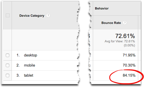
If you see a much higher bounce rate on a particular device, it indicates a potential problem in how your site is displayed on that device.
For example, the stats above appear to indicate an issue with tablet computers, with bounce rates for desktop and mobile otherwise roughly comparable. Either take a look at your site using the device in question to identify the issue, or try an online emulator.
By the way, whether a bounce rate is good or bad depends entirely on the nature of the website or page you are looking at. For example, blogs and landing pages generally have much higher bounce rates than retail and service sites.
The important point is that ensuring your bounce rate is as low as possible has numerous benefits, including increasing your visibility in the search engines (with lower bounce rates indicating higher satisfaction levels from search engine users who click through).
However, checking your bounce rate and viewing your site across different devices is just part of the equation. You should also check whether Google considers your site to be mobile-compatible or not.
Do You Have A Mobile-Compatible Website?
To ensure your website is listed in Google’s mobile search results, you need to run a quick check with their mobile-friendly test tool. It takes a minute or two to run.
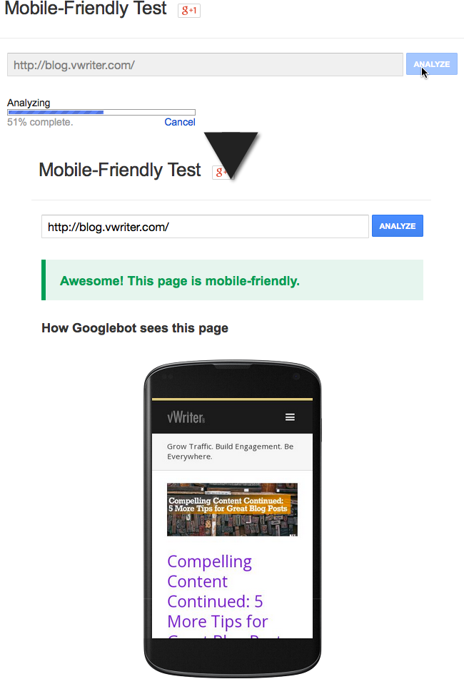
Use Google’s mobile-friendly test to check your own website
There are a couple of important points to note:
- The tool checks an individual page rather than your website as a whole. So, depending on how your site is structured, you may find some pages are mobile-friendly, whereas others do not pass the test.
- It will not pick up on issues with individual devices. For example, you might find your site is mobile-friendly, but still has an issue in its appearance on tablets.
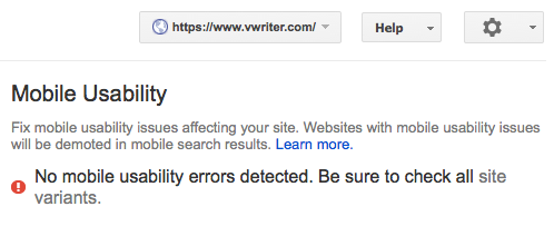
To view mobile compatibility for your website as a whole, use the tool within Google’s webmaster tools. You select your site (or add it), and Google will then list any issues or give you the all clear.
Fixing Mobile-Compatibility Issues
Got problems? What then?
In website development parlance, the key word is responsive. Your website needs to have responsive design. That means it will respond to the device it is being displayed on, and adjust itself accordingly so it displays correctly.
WordPress
The good news is a blog based on WordPress is relatively easy to make responsive, and therefore mobile-compatible. All you need is a responsive WordPress template. Do a quick Google search and you’ll see there’s no shortage.
There are free responsive themes available, but be prepared to invest up to $100 or so – possibly more – for a good responsive template. You’ll then likely need a developer who can install it for you and get your site looking as it should. Your usual webmaster should be able to take care of it, or try hiring someone on say Fiverr or via Hubstaff Talent.
Once done, you’ll reap all the benefits (as outlined below) from having a responsive blog.

Themeforest (aff. link) have a good selection of responsive WordPress themes
Other Sites
Unless you’re on a platform like WordPress, you’ll have to invest in a redesign of your site to ensure mobile compatibility. Or possibly look at moving to a WordPress-based site with a responsive theme as outlined above.
The former won’t come cheap. But it’s cheaper than doing nothing, and ignoring the impact of mobile. (See below for more info on the costs to your business of the ostrich, head-in-the-sand approach).
Get a number of quotes from different web developers, and avoid the extortionate and the really cheap. Or just have your usual webmaster work on it over the course of a few months.
You could potentially also take the approach of doing a few pages, or different parts, of your site at a time if it’s a substantial project. For example, you could concentrate on the most important pages to start with, and get the rest of your site done over time as your budget allows.
However, be aware that this may well cost you more overall, and you could end up with a website that looks less cohesive if different developers are involved.
Above all, ensuring you have a mobile-compatible website is an investment in the success of your site long-term. With the mobile revolution now in full swing, as a result you’ll benefit from numerous advantages that help your website ‘Be Everywhere’ for your marketplace.
I’ll go through these now …
Be Mobile-Compatible … “Be Everywhere”
In any doubt as to why you should now ‘go mobile’?
Just in case, I’ll run through several reasons why you must now have a responsive, mobile-compatible website to ensure you can:
- “Be Everywhere” in front of your marketplace …
- Build your relationships, your credibility and your authority …
- And ultimately build more traffic, leads and sales for your business.
Enjoy more traffic from Google.
We’ll do the obvious one first. As stated above, your website has to now be mobile-compatible in order to be listed in Google’s mobile search results.
Roughly half of the people searching on Google are now on a mobile. So this one’s kind of important!
Enjoy more traffic from social.
Yes, it’s not all about Google. Social has recently overtaken search as the #1 source of traffic referrals, and they are far more likely to be on a mobile device. For example, around 80% of Facebook users are mobile. It’s a similar percentage for Twitter.
That means for traffic coming to your website from social, to take advantage and for those visitors to stick around, it’s essential you have a mobile-compatible website.
But how does that equate to more traffic?
Simple. Visitors arriving at your site from social are more likely to share your site on social. They’re already in a sharing environment. They’re logged in and ready.
You’re also more likely to keep your followers. Let’s say you share a link to your latest blog post on Twitter. Four out of five (80%) access the link on mobile, but your page looks terrible because it’s not mobile-compatible. They quickly click leave. You not only miss out on a potential share, but they are more likely to both avoid your updates in future and decide to stop following you.
This all equates to less traffic for you going forward.
Attract more social followers
With 80% of social users on mobile. they are far more likely to follow you, like your page and so on, when your content is available and easy for them to view on their mobile device.
(See related resource: 5 Key Ways to Increase Your Twitter Followers (Without Buying Them!))
Find it easier building JV partnerships
If you’re aiming for a joint venture for someone, you might reach out to them through social or email. These kind of partnerships can rapidly escalate your online visibility and help you “Be Everywhere” for your targer market.
Let’s estimate there’s a 50% probability the person concerned will access your communication on a mobile device. If they click through to your site, and it’s difficult to view or just looks all messed up, what’s the likelihood? The reality is they will probably give you zero credibility and dismiss your communication out of hand.
For pursuing profitable partnerships, mobile compatibility is once again essential.
Build subscribers … and keep them
As outlined in the “Be Everywhere” Blueprint, a key part of the process is build up your email list.
If your website is not mobile-compatible, you’ll firstly be able to attract far few opt-ins for your list than you would otherwise.
Secondly, just think about people on your list. Around two-thirds of people now open emails on a mobile device. That’s hugely significant.
If you’re sending them back to your site and it’s not mobile-compatible, you’ll lose those subscribers. You lose credibility and authority, and they can’t gain any value from your content. They’ll unsubscribe, or simply stop opening your emails.
Your deliverability levels will drop along with your open rates. (Services like Gmail use the open rate to determine how to treat your emails).
You’re not just losing subscribers, but losing customers.
Enjoy more effective advertising
For advertising, mobile ads through ad networks like Facebook and Adwords are still a lot cheaper than non-mobile. Often it can make the difference between a cost-effective campaign with a positive ROI, and one that ends up costing you more than you make.
If you’re sending people to a mobile-compatible website, all well and good. On the other hand, without the mobile compatibility, you’re restricted to the type of ads you can run. You may find it very difficult to find effective advertising that has a positive ROI that will help you to scale up your business.
For example, let’s say you’re running solo email ads through a network like Udimi. With two-thirds of people now opening emails on mobile, your ads are obviously going to work far more effectively with a mobile-compatible website.
Better results from video
Engagement with video by mobile users can be far higher than other users – in fact they are three times more likely to click through to your site.
To benefit from this traffic, and to have more chance of converting them to say an opt-in or have them follow you on social media, your website must be mobile-compatible.
Improved results from your videos also encourages and funds further videos, all building up your online visibility and helping you “Be Everywhere”. See the “Be Everywhere” Blueprint for how videos fit into the overall process.
However, be aware that you do need to be quicker in grabbing the attention of a mobile consumer of your video content, as they will watch a video for a much shorter time than they would on a desktop.
Finally … Desktop Still Wins For Sales
As you can see, ensuring you have a mobile-compatible website is of course now essential. But it’s not all mobile.
According to research from Monetate, add-to-cart and sales conversion rates are much lower on smartphones than they are on desktops (though tablets are roughly comparable). In other words, it’s important to be mobile-compatible, but to then get as many prospects into an ongoing relationship with you as possible (such as via email) so you stay front-of-mind.
Despite all the importance of mobile, your future customer’s actual purchase, at some future point, is far more likely to be on a desktop.
(See related content: How to Really Monetize a Blog)


I think today mobile app and mobile sites are generating more revenue for business than normal desktop sites. There is more requirement to test these sites rigorously so that they do not break on any device your customer use. https://www.lambdatest.com/ is one tool to perform cross browser and device testing easily.
Hi Junaid, thanks for the suggestion, looks a good tool.